After a break of one year the Animated Encounters Festival returned to Bristol in 2005. Once again I had the honour to produce the title sequence for the festival which would be shown before each screening.
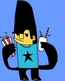
As usual the title sequence was to be based on the designs used in the rest of the publicity material. This year Tijuana Design were responsible for the festival design. In turn they used illustrator Jon Burgerman to create a range of characters. Early on it was decided to only use two characters in the title sequence. After some consultation the following odd looking fellows were selected.
The free hand nature of the drawings suggested that the animation would be either traditional 2D drawn animation or Flash. At this point I realized that I would more than likely have to hand over the animation side of things to someone more proficient in these techniques. The previous Animated Encounters trailers that I have been involved with have all used my preferred technique of cut-out style animation. On this occasion I had no qualms about handing over the animation to someone else. In fact it freed me up to be a bit more adventurous with the idea as I knew I would not have to be the poor so and so to execute it. I would direct and edit the piece.
I soon decided that out of the two illustrations I preferred the Punter character with his popcorn and drink. I also had a problem thinking of a situation where both characters would meet. The Punter is patently at the cinema where as the Animator is in his studio. Obviously I could have a story where we cut between both locations but I felt that the story should remain quite simple and in one location. After all the animation was only supposed to be about thirty seconds long. I prefer to keep things simple as then you have less risk of getting in a muddle or confusing your audience.
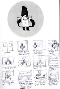
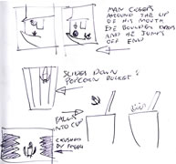
After a bit of thinking I came up with an idea where the Punter would enter the cinema and then entertain himself with his props before the show begins. He’d walk into the screening room sit down and then hold his drink and popcorn cup up in the beam of projection light. He’d then use them like shadow puppets making silly vocalizations as if they were characters. The gag would come when the logo flies into shot on the screen crushing his shadows and raining drink and popcorn down onto himself.
I quickly sketched up a very rough storyboard.
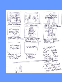
After completing the animatic I took some time to consider any improvements that could be made. After a while I came to the realization that a really big improvement would be to scrap the whole thing. Basically I didn’t think that the end gag was obvious or understandable. I was also worried that it relied too heavily on the one joke. You have to remember that some audience members are going to see this trailer many times as they attend several screenings at the festival. As it stood once you had seen the trailer once there was no real reason to want to see it again. What was needed was something that could hold up to repeat viewings.
I went through a period of staring at the character thinking of what I could get out of him. As I looked at the illustration I began to see structures within the drawing that I could use. It occurred to me that I could use parts of his body as the settings for a journey. He could literally move around the contours and shapes held in the illustration. I devised a concept where the man enters the cinema only to be sucked into a strange journey through himself. To make things even more complicated, after appearing in one part of his body the camera would zoom into himself where he would then pop up again. So it would almost be one continuous shot where the camera would continue to zoom in again and again. I enjoy these visual ideas and felt that it presented something interesting to the audience.
With time getting short I quickly made another animatic to give the animator some idea of what I wanted to achieve.
Below is this second animatic. At some points you may find it difficult to see what’s going on. Don’t worry, you’re not being stupid. The truth is that I put this together very quickly. I didn’t have time to finesse some of the details like changing the colour of the background. Which isn’t very handy when your mostly black character pops up on a black background. Anyway, it was enough to give the animators an idea about what I was talking about when I was waving my arms and saying “and we zoom in and zoom in and zoom in!”
By this stage it was clear the the animation would be created in Flash. At my request Jon the illustrator had converted his original Adobe Illustrator files to Flash. This saved us some time and allowed us to get stuck into the animation quickly. It turned out that all of the in house Flash animators were busy. So at short notice we hired a freelance animator for a week. Unfortunately I was unable to give as much direction as I would have liked to the animator as I was busy on other projects. At the end of the budgeted week we had to let the animator go as there was no more money available. So now we had a problem. Although all the scenes had been animated to a degree they still needed more work and we had no animator. Time to beg.
Stefan Warren is an extremely enthusiastic and energetic animator. He was working on a Flash based series that we had in production at the studio. Luckily he had some spare time on his hands and agreed to help out. I gave him the animatic and the animated Flash files. I spent a bit of time going over the concept with him and he seemed quite excited. He always seems quite excited. We were losing time fast. I needed the animation finished by the end of the week so that I could present it to the musician before I went on holiday the following week. I was confident that Stefan understood what was required and left him alone to get on with it. I’d occasionally check up on him to see where he was at. I was always pleasantly surprised. Stefan works really quickly. He’d even started to add some of his own ideas into the shots. I had nothing against this. I’d been deliberately cautious about putting too much into the animatic scenes simply because I was worried about how long it would take an animator to produce. So if Stefan thought that he had the time to add more, then that was fine. In the end Stefan found it easier to scrap the original animations and create his own from scratch. His work would have stuck out against the original animations because there was such a difference in style. Amazingly it took Stefan three and a bit days to complete the animation. He actually worked over night in the studio on the final evening. I was very pleased with the end result even if Stefan’s’ enthusiasm had made the animation run over length slightly.
After a little bit of editing the animation was ready to go to the musician. Nathan Ng from Beneath the Bed Productions had previously composed the music for the 2003 Animated Encounters trailer. So I was happy to give him a guide of what I wanted and then let him go do his stuff. I generally wanted something a bit quirky with a good beat. I may even have used the words “toe tapping.” Oh yes, I’m in touch with the music of today. I know what the kids want.
After about a week Nathan returned with the music. He describes it as “A retro-funky beat with slapped bass, Wah-wah guitars and a variety of strings.” Yes, that’s how I’d describe it, oh yes. It did the job perfectly. At my request Nathan had added in some sound effects to help some of the visuals. He’d even roped in Mandi Stark, the festival coordinator, to perform a voice over.
Finally there was just time to do a couple of tweaks to the edit and add some small visual touches. Part of the music sounded like an old dramatic film score so I changed the visuals to black and white and added a film grain. Another section was supposed to look like a computer game so I used a pixelated effect to give it the appearance of a TV screen. Most importantly the company sponsor logos all had to be added to the end. In total there were thirty six logos to be added. It’s always the most fiddly part of the trailer. I have to make sure that the logos are of relatively equal size and that they look balanced in the frame. It’s not always easy because a lot of the logos are different sizes and shapes. I have to make sure that everyone gets equal billing or at least equivalent to how much money they’ve paid. Which means I have to resist the temptation to make the A Productions logo gigantic.
As a nice finale I decided to bring the character back in at the end. No animation had been created for this so I stole some from earlier in the trailer. With a little bit of cutting and pasting I had the character walk back in before being crushed by a larger version of the boulder that we had seen earlier.
That was it. Finished. It was then delivered to the festival office where it was immediately screened before the regular cinema screenings to promote the upcoming festival. Lovely.
Here it is. The final trailer.
[youtube]http://www.youtube.com/watch?v=G8ZDbhP1wks[/youtube]
